

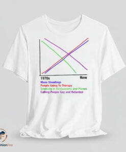


The 1970s vs Now graph shirt is a thought-provoking and deeply satirical piece of apparel that uses data visualization to offer a biting commentary on shifting societal norms. Set against a crisp white cotton base, the central graphic features a hand-drawn line graph comparing various social phenomena from the 1970s to the present day. The colorful lines—rendered in purple, red, green, and magenta—crisscross the white fabric to create a design that is visually striking while forcing the viewer to engage with uncomfortable truths about modern life.

The lower half of the graphic provides a key that anchors the abstract lines in specific, controversial topics. According to the legend, the upward-trending lines represent the rise in “Mass Shootings” and “People Going To Therapy,” while the downward-trending lines track the decline of “Smoking in Restaurants and Planes” and “Calling People Gay and Retarded.” This juxtaposition of genuine public health improvements alongside tragic social crises creates a jarring, dark-humored observation about the complexities of progress and the unintended consequences of the modern era.
Wearing this 1970s vs Now graph shirt projects a persona that is intellectually curious, cynical, and unafraid to confront difficult conversations. It functions as a powerful tool for social observation, signaling a personality that uses irony and “edgy” humor to process the chaotic nature of history. The clean, minimalist layout ensures that the graph remains highly legible, making it a standout addition to a casual wardrobe for those who appreciate subversive graphic design. It is an ideal garment for individuals who want to spark debate and showcase a sharp, analytical perspective on how the world has changed over the last several decades.
Related products

Apparel


Apparel

Reviews
There are no reviews yet